


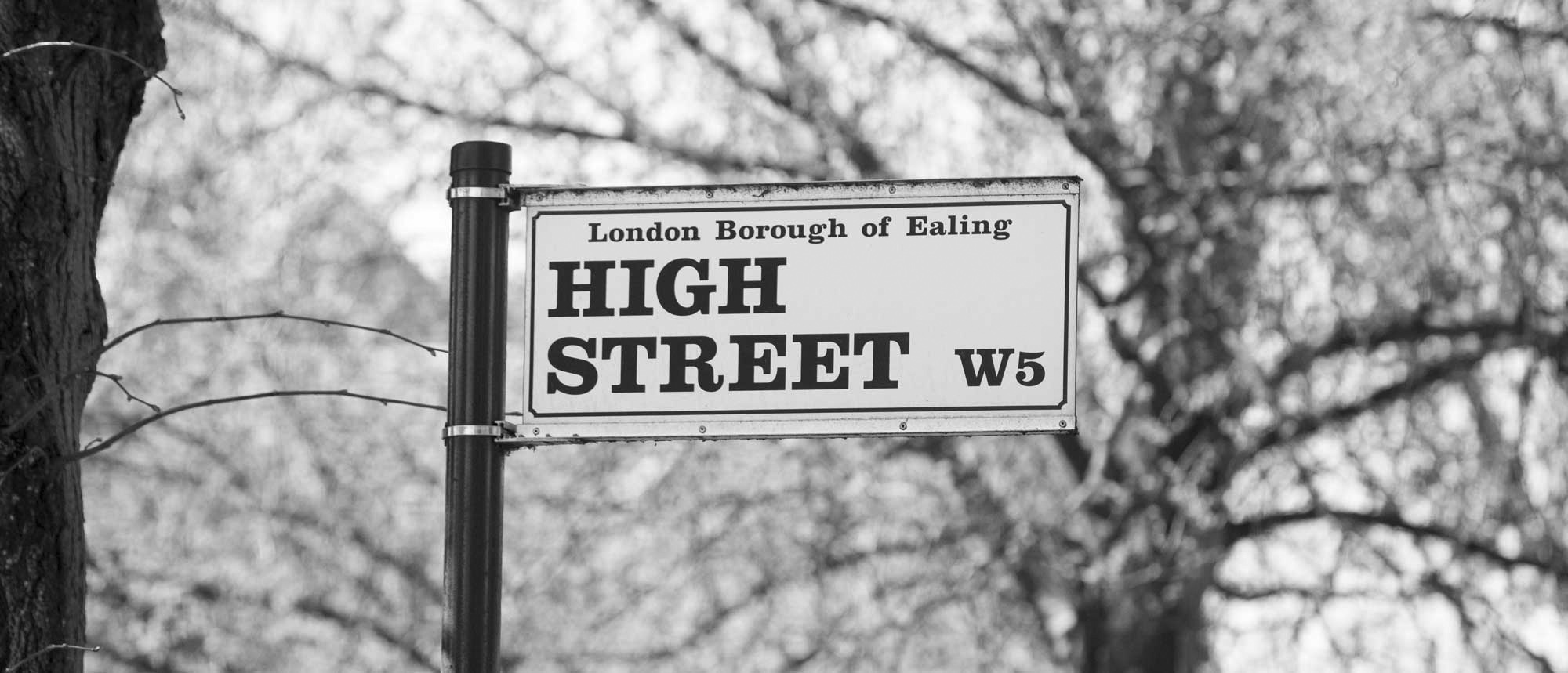
Restaurant branding in Ealing
Living in close proximity to restaurants, bars and cafés in Ealing I am always on the lookout for the next restaurant or café branding, whether they be new, or occupying current spaces.
I’ve observed some restaurants have much more staying power than others and I wonder what constitutes this? It could be the food, it could be rising rents for certain restaurant spaces that owners cannot keep up with, the saturation of a type of food a restaurant serves, for example, multiple burger joints or Middle Eastern restaurants, the service, and so on.
Some of the better established chains have more success like Nandos and Wagamamas, which are always packed out. Wagamamas, for example have inventive healthy menus alongside their classics, contemporary branding that works around some strong food photography and fast and friendly customer service. It also helps that they have money to invest which enables them to improve their overall customer experience.
Farm W5, the organic independent deli, manages to pull in the customers with its focus on healthy, organic range of dishes, fresh juices and organic brands and produce on sale. Their menus are all displayed on chalkboard and it fits in well with their rustic interior, never seeming too contrived. Staff are amenable and the atmosphere intimate.
As lovely as these spots are amongst many others in Ealing, there is also a group so badly branded it makes my eyes water – seriously! Poor use of typography on a restaurant exterior (which allows us to sum up a place within seconds) along with pixelated photography (think 5 year-old with a camera going in too close) garish colours and illustrations, and you get the picture!
I understand budgets can be challenging for businesses, but it doesn’t actually have to cost the earth for good design, you simply have to have an astute creative eye behind your brand. Unfortunately not all business owners have that skill nor are they prepared to hire someone for it. It is worth having a budget for branding because its long-term value and effect far outweighs the original budget invested (along with successful marketing, customer service, food, etc, of course).
When I was doing some exterior signage work for Bad Egg in Moorgate, we had to comply with the local council on what was acceptable in terms of branding and how it had to seamlessly work with the surrounding building exteriors and spaces. The result was a combination of the brand cleverly utilising the light coming in from the tall floor-to-ceiling windows and displaying neon signs that flashed to entice customers, you can imagine the reflective and eye-catching quality from a distance. Who’d have thought it shared the same facade as a law firm a few hundred yards down!
Another example of this is Bellenden Road in Peckham, South East London. Artists such as Anthony Gormley and Tom Phillips have lived and worked in the area. As part of Southwark Council’s Bellenden Area Renewal programme, Gormley designed street furniture and sculptural bollards that scattered the area. Phillips designed hooded snake-like lampposts and mosaics that adorned building exteriors. Shop fronts were redesigned so the branding had it’s own unique identity through colours and typography, but fitted well with each other.
Closer to home, I am happy to see that the Dickens Yard development have got it spot-on with branding for the new eateries popping up. They don’t overpower the design of the stunning, historical 18th Century church, Christ the Saviour, which is a focal point in the vicinity. The new development architecture was designed to work alongside it.
My dream (here goes!) is to have a Brand Ambassador for Ealing Town Centre who gets to advise and authorise on branding in the local area so that identities work in unison with each other whilst making their own mark. It is important to take in your environment and surroundings when designing. Think about who will see it as they pass on foot or transport? How does it work alongside the surrounding shops and buildings? What is the demographic? I believe brands should be able to pull each other up in a given space, they will eventually reach an appealing identity without compromising too much.
After all, “A picture is worth a thousand words”, which I agree with, but replace ‘picture’ with ‘design’ and you catch my drift.

